Harbin Metro: Maybe the Most User-Friendly Interaction Design?
I was thoroughly impressed by the Harbin Metro.
The stations were clean, and also distinctive in their design.
Here’s what their metro card looks like.
And particularly impressive was the interaction design.
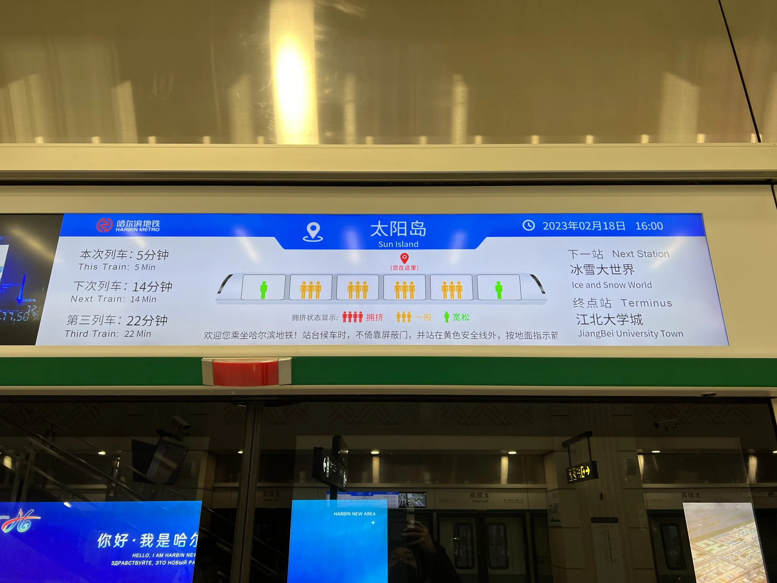
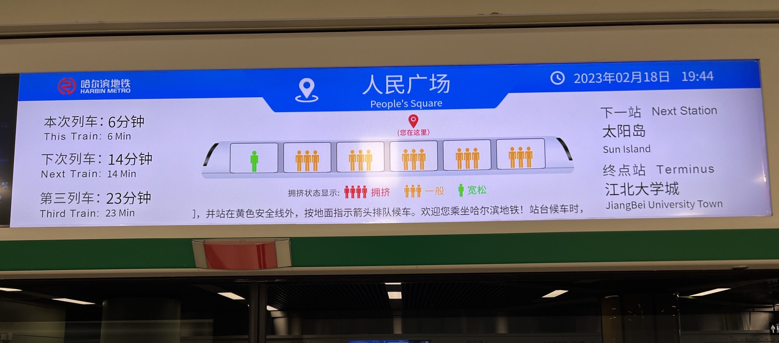
While waiting on the platform, there are these screens above each door showing when the next trains were, which was the next station for the train, and the final destination. Normal things for advanced metro systems. What was the amazing part was that the screen also showed how full each of the cars were in the incoming train! So I could see, for example, that if I went to the car at the end on the left side, I should encounter a less-occupied car!
And then inside the train, there was a clear map of the line, and also a map of the next station’s exits and surrounding area. So you can plot your next steps easily.
When the train approached the station, there was a diagram showing which side was the side the doors would open.
And the awesome part here, was that you could see where your car would stop in relation to the stairs, elevators, and exits!
So for example, at this station, I could see that I should turn right out of the car, in order to find the escalator up towards the number 3 exit, where Sun Island was.
At each station, there were detailed maps of the area surrounding the station.
And by each exit, even more detailed information with labeled buildings too. This was the exit near the Shangri-La I moved to for my second night.
My impression is that Harbin Metro might be the most user-friendly metro system that I’ve encountered, anywhere in the world!