What's Showing in Art: MoMA Talk to Me Exhibit
"Talk to Me" is an exhibit about (somewhat) current interaction design around the world. It's curated by Paola Antonelli and Kate Carmody (Curatorial Assistant), and like most exhibits curated by Antonelli, "Talk to Me" operates more as a survey that skims across disparate categories, giving the viewer a birds-eye view of interaction design without necessarily a strong thesis.
I appreciate Antonelli's expansive view of what "design" is, something that challenges the design world in the United States. There were functional pieces like Ideo's BBVA ATM, and a working MetroCard kiosk that outputted a special edition MetroCard (with advertisement of the exhibit on the back, I believe). On the other end of the spectrum, there was a piece called "Tentacles" by a group of Canadians, where you download an app onto your iOS or Android device and control a mythical organism on the projected screen, along with other users. I also liked "Gentrification Battlefield" by the Dutch group Golfstromen, where you play either an elderly resident or young hipster in a gentrification battle of Nord-Amsterdam.
On the other hand, I wish there was an even more edited, curated group of pieces. Fewer items would have allowed me to better concentrate on different aspects of each design, and make connections or contrasts with other pieces. There were also a lot of pieces that I've seen again and again, in MoMA design exhibits across a variety of themes. Excellent pieces, such as Christien Meindertsma's PIG 05049, but I wish the curators would give them a rest occasionally. Each piece had a QR code next to it, which you could scan with your phone to "learn more." This was little more than a gimmick, because the QR codes would pull up a page with the designer names, and a Flash video. The wall text already had the designer names, and there would nearly always be the video playing already. And how many devices can play Flash videos, or play them well?
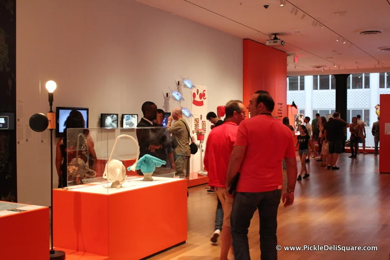
Most importantly, there were also far too many pieces where you look at the object inside of a vitrine, or you just watch a video about the piece demonstrating its interactivity. For an exhibit that's all about interaction design, I wish more pieces would have been pulled into the present, where the viewers can actually interact with the piece as the designers intended. Perhaps there were too many pieces which didn't actually work in the real world, but the exhibit tended towards the idea of a musty museum, displaying objects that had relevance in the past, but no longer.


