Hi there! Pickle Deli Square is a collection of my experiences living, eating, and traveling the world. Currently an expat based in Valencia, on the Mediterranean coast of Spain.
All in Lodging
Aum Leki Farmstay and cooking class, Punakha
A magical home in the clouds, where we learned how to make Bhutan’s national dish, ema datshi, chili cheese.
Relief: Shangri-La Harbin Songbei Hotel
After the horrible experience at the city-center hotel, I found relief at the Shangri-La.
Scary: Harbin Huasu/Shiju/Ji Feng/Yu Feng/Royal Maple Hotel
Like arriving at a horror movie set, at a hotel which just couldn’t get its name straight.
Amazing Farmhouse Retreat: Masseria Salinola, Ostuni, Italy
A deeply restful stay in a tastefully decorated farmhouse, just outside of Ostuni. I wish we could have stayed longer!
Like a Dream: Sextantio Le Grotte Della Civita, Matera, Italy
A refined sanctuary, living in a cave.
Lodging Review: B&B Dei Cardinale, Bari, Italy
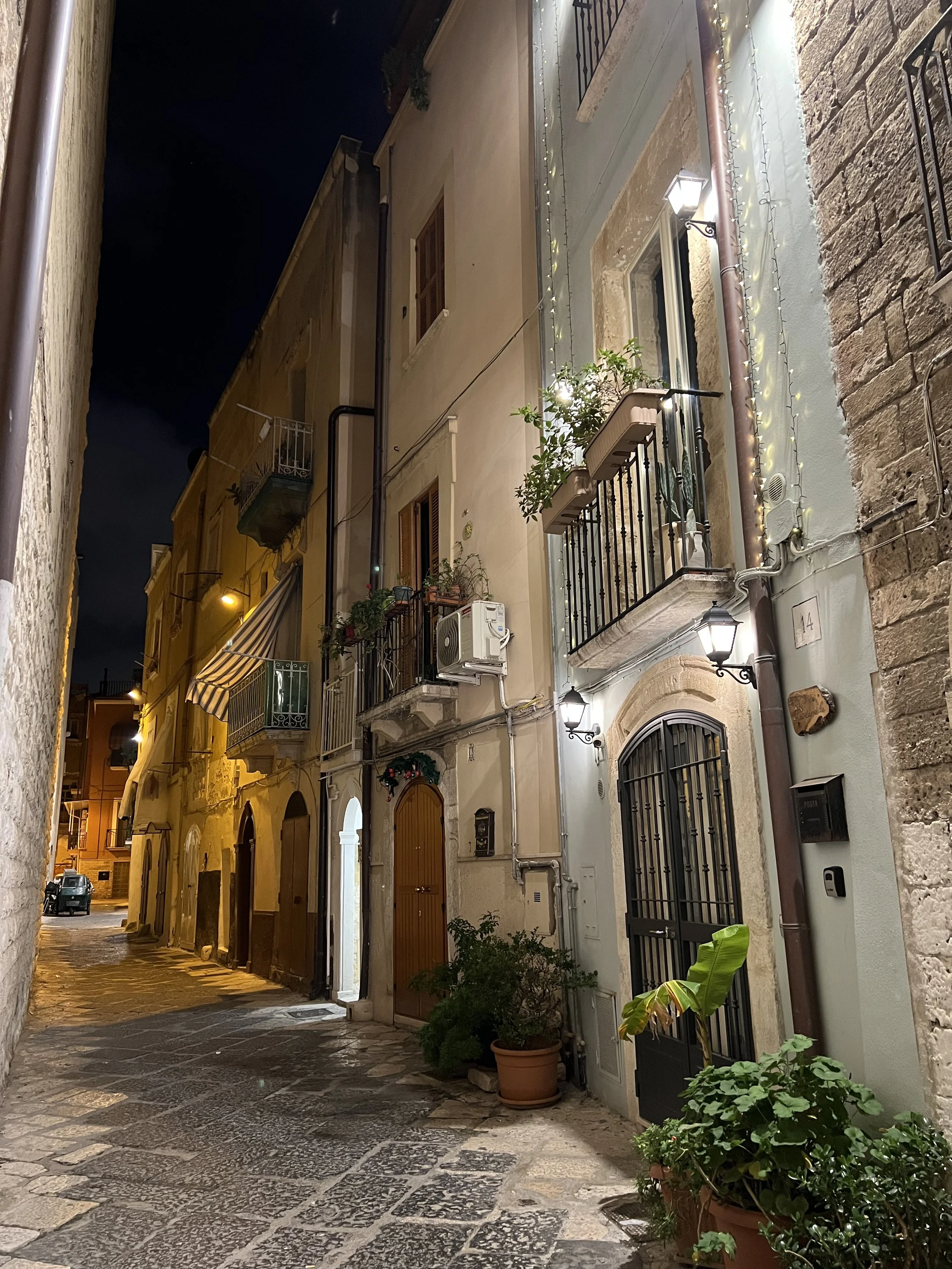
A delightfully renovated bed & breakfast in the pedestrian old town of Bari (Città Vecchia).
Lodging Review: Meizhou Chengyu Hotel
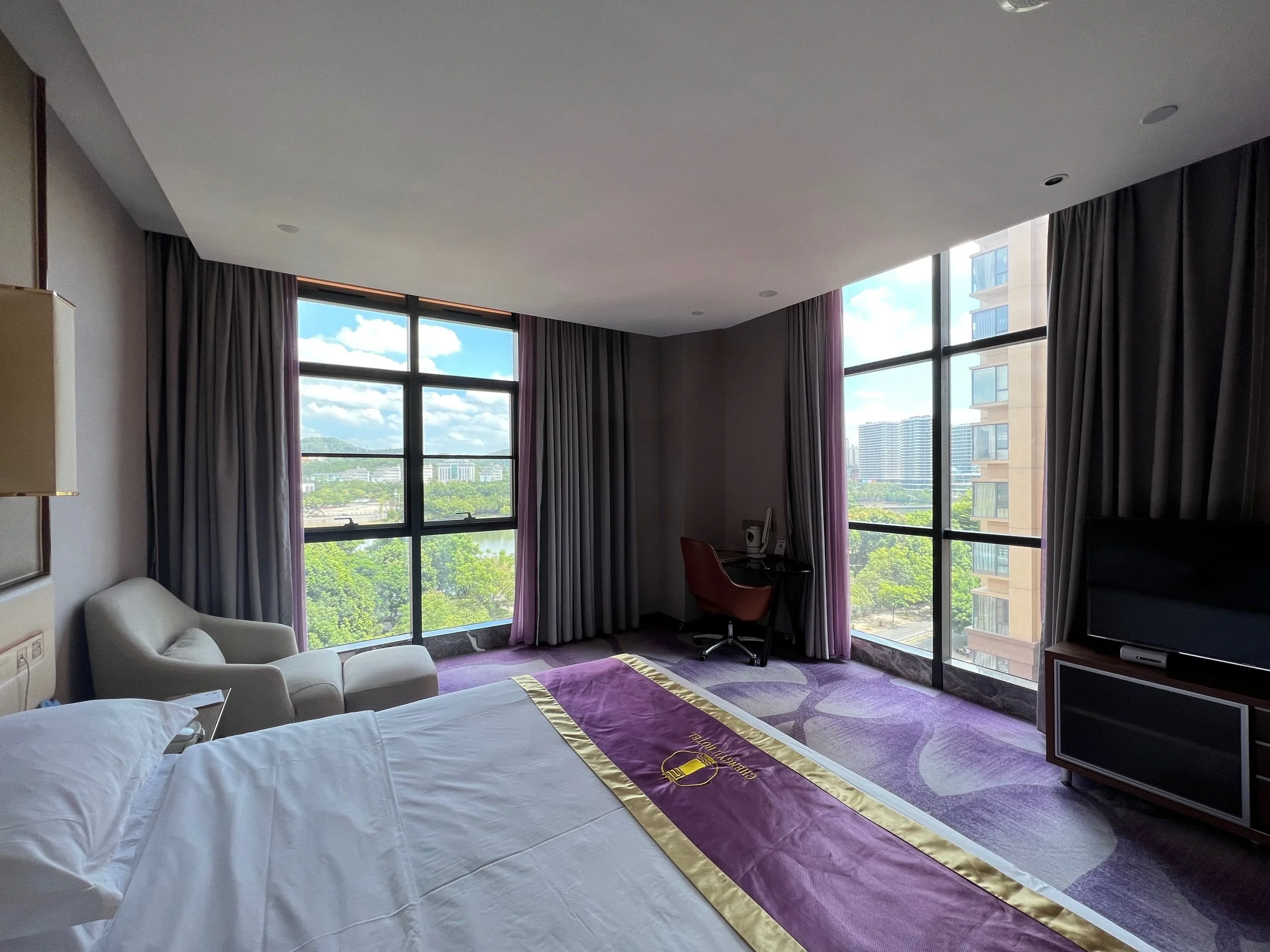
Modern, functional, purple.
Room and board (and cooking class!) review at Changdi Inn, Yongding Tulou (永定土楼洪坑村常棣客栈)
A warm stay, from booking all the way to farewell.
Lodging Review: Barceló Sants, Barcelona, the Space Odyssey Hotel
Conveniently situated right on top of Barcelona Sants train station, the hotel is a great option for getting to Barcelona airport for a morning intercontinental flight. The space station decor put me in the mood for an intergalactic flight.
Hotel Semáforo de Bares, Galicia: 360 Views and 5 Star Service
A rare (for me) relaxing stay in a former Navy building in the most northern tip of Spain, all made possible by an angel of a single employee.
Lodging Review: Only You Hotel Atocha, Madrid
An impressive show all around, from a cool interior design to a very on-trend breakfast to wonderfully friendly staff.
Lodging Review: Guesthouse SelfMatic near Bergamo Airport, Italy
An eerie stay with no human contact whatsoever - guests, staff, or otherwise.
Lodging Review: Renaissance Naples Hotel Mediterraneo
Magnificent views from the hotel's rooftop terrace were the hotel's best asset.
Lodging Review: Hotel Mignon in Sorrento, Italy
A spare single room is compensated by a pleasant breakfast.
Lodging Review: Hotel Il Convento in Naples, Italy
From a generous offer for breakfast upon check-in, to a sweet parting gift, Hotel Il Convento set the standard for the small, independent hotels that abound in Italy.
Bogotá Eats: Dining at the JW Marriott
Raiding the executive lounge and breakfast buffets
Lodging Review: the unabashedly old-fashioned Marriott Milan
There have been a lot of innovations in hotels in the last couple of decades, from big things like making lobby spaces more multifunctional - integrating lounge space, restaurant space, and check-in space for example - to simpler things like getting rid of highly decorative wallpaper and heavy drapes for a cleaner look.
In fact, last year I stayed at the Moxy Milan Malpensa hotel for a night during Design Week, and absolutely loved it. A new brand from Marriott, Moxy hotels try to give you just what you need, no more, no less. So arriving on a late flight, I was glad there were local food and drink options right in the lobby/check-in-desk/bar. The room was small but I didn't lack for any more space, being just a short layover. The bathroom was great. I really feel like they studied travel habits well and designed the hotel around the experience.
What hotel hasn't apparently changed in the decades? The Marriott Milan.
Lodging Review: Haymarket by Scandic, Stockholm
I'd stayed in a few Scandic hotels in my previous travels through Sweden - once each in Stockholm, Linköping, and Gothenburg. They were all pretty nice, clean hotels, approximately the standard of a Hilton Garden Inn perhaps.
So I was curious what kind of hotel "Haymarket by Scandic" would be. Usually when someone puts a new name, followed by the world "by" and then the original brand name, it means that the new concept departs from the original brand in some way.
And the Haymarket certainly does! In fact, I'm not really sure what the "by Scandic" buys it from a branding perspective. The Haymarket is a hip, stylish hotel built in a former department store, and carries a 1920s glamour theme consistently throughout the experience from the logo typography down to the last details of even the bathroom mirror and coat rack.
Lodging Review: Hostal Mesones Granada
At 25 € per night, Hostal Mesones might be one of the best values in lodging that I've ever encountered...


